How the Federal Finance Administration offers the public insight into its data
8. April 2024

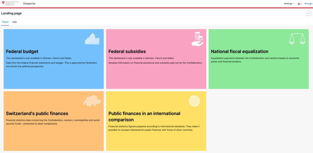
Topics
The Federal Finance Administration (FFA) has a diverse portfolio of data relating to Switzerland’s finances. For example, it shows how much money the financially strong cantons transfer to financially weaker cantons as part of the national financial equalization system or who benefits from subsidies in Switzerland.
This is all valuable information for the daily work of politicians, journalists and many other interested parties. In the past, the FFA has therefore increasingly responded to a wide variety of inquiries for very specific analyses – this led to the need for a comprehensive dashboard that presents this public data in an attractive way.
In interdisciplinary teams consisting of specialists from the FFA and data and visualization experts from Datahouse, five dashboards on various core topics of the FFA have been developed over the past few months.
The FFA was explicitly looking for a tool that could display interactive chart types such as bar charts, time series or maps. In addition, the data displayed should be able to be tailored to the user’s needs using filters. It was also important to be able to download the user-defined evaluations as a CSV or Excel file. The Apache Superset business intelligence tool offers all these options. Datahouse has already implemented many dashboard projects for customers with this open source tool and with this experience it was possible to successfully implement the complex requirements of the FFA.
The right visualization for every data set
Diverse data, as published by the Federal Finance Administration, requires suitable chart types. In Superset, the data is displayed in line charts over time, pie charts and bar charts or as simple tables, depending on the intended use. A treemap chart is used to clearly show the user the origin of federal revenue. In contrast, a Sankey diagram is ideal for visualizing the financial flows within the framework of federal financial equalization.
The right chart type for every data set: revenue over time is visualized as a line chart, the distribution of revenue by origin as a treemap.
The cash flows are shown in a Sankey diagram.
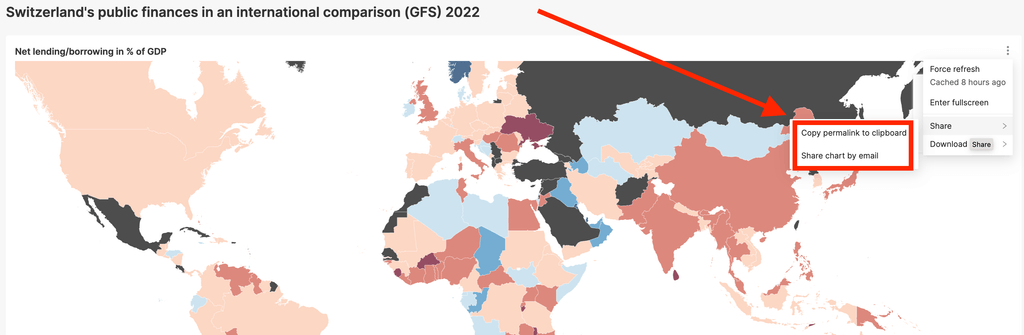
To provide a quick overview of the financial starting positions of the individual cantons, several data sets were visualized as interactive maps. The map is recolored depending on the filter selected. By the way: Maps in Apache Superset can do much more – read here how another dimension can be depicted with 3D maps.
Options for personalizing Superset
Apache Superset is an open source solution and therefore offers the possibility to meet even very specific customer needs. For example, the dashboard of the Federal Finance Administration was implemented in four different languages: German, French, Italian, and English. Each of the five topic dashboards and the homepage exist in all four languages. If a user is already on a certain topic – but in the wrong language – they can use the flag icon at the top of the screen to switch to the dashboard for the same topic, but in their preferred language. Superset has various system languages as standard – but certain translations can also be adapted if required. In this project, the Swiss currency formats were also configured in the source code.
Permalinks are a frequently used function in the dashboard of the Swiss Federal Finance Administration. For each chart, a permalink can be copied to the clipboard or shared directly via e-mail. This allows the Federal Administration to link to a specific chart in a media release, for example. It is worth noting that the current filter selection is stored with a permalink. For example, a bar chart with expenditure on very specific categories for a selected period could be forwarded to interested parties.
Superset was also personalized in this project with regard to user authentication: the login to the Superset backend was connected to the federal government’s own Identity & Access Management solution. This means that the federal employees involved can also use their central login to maintain the dashboard.
Regardless of whether you are looking for a simple dashboard solution or have very specific requirements – we will be happy to advise you on the possibilities.