Blog, Data science, Software, Uncategorized
Plotting equality: From bar charts to 3D maps
06 Mar 23
With the open source tool Superset, impressive interactive dashboards can be designed with just a few clicks. In an earlier blog post we covered the data connection and filter options. Today we take a look at the different visualisation possibilities – on the occasion of International Women’s Day on March 8th with data on gender equality in Switzerland and worldwide.
Apache Superset: Proven chart types
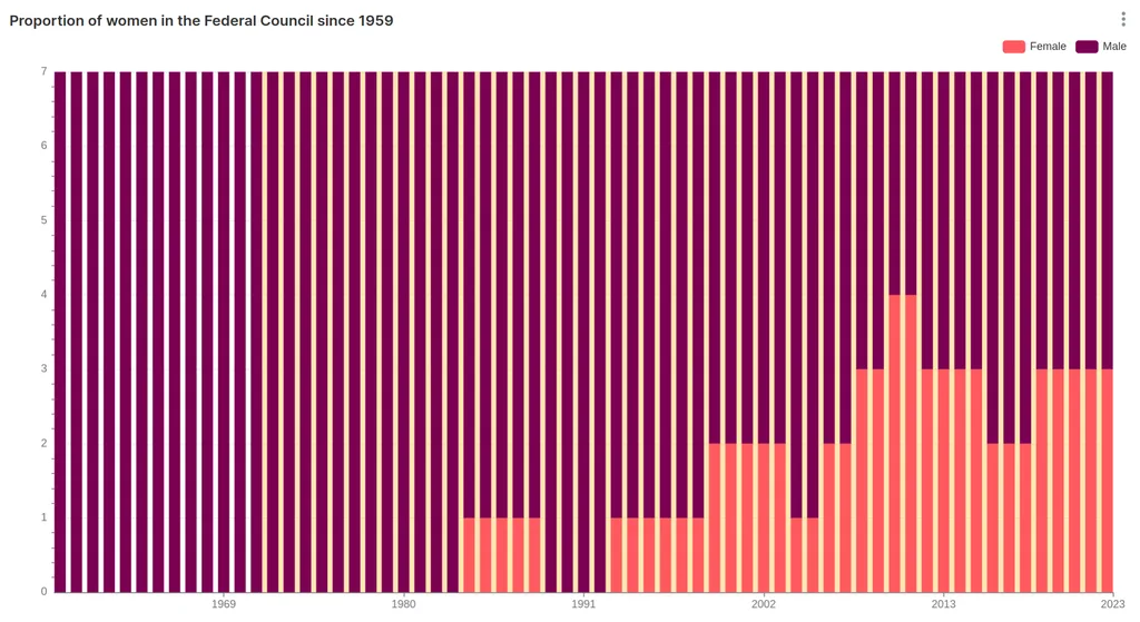
The business intelligence tool Superset, which is developed by Apache, contains over 60 different chart types – including all the usual suspects as bar, column, line or pie charts. Depending on the type selected, different options for modification are available. In our first example, the gender distribution in the Federal Council since 1959 is shown. A stacked bar chart was chosen for this purpose. In charts with time axes, user-defined areas or points in time can be highlighted with extra visual information – so-called annotations: For example, the yellow area here marks the period since the introduction of women’s suffrage in Switzerland.
Visualisation of text
Superset also offers options for processing text. Particularly extensive is the chart type “Handlebars” for creating user-defined templates that dynamically display text. For example, a table of all parliamentarians could be automatically coloured according to gender. Handlebars can also be used to integrate icons or images such as cantonal banners into the dashboard.
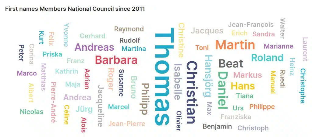
Word clouds are another option for visualising text. With a few clicks, all the first names of members of the Swiss National Council since 2011 that appear at least twice can be displayed. The larger the name is written, the more (former) National Councillors have this first name.
Geographically locate data
Superset offers a particularly large variety of options for displaying geodata. If you want to display the proportion of women in national parliaments, you load the corresponding table into the chart type “World Map” and the assignment is done automatically via the country name or via international abbreviation standards. Also convenient are the automatically generated tooltips that show details of the displayed value of a specific country when the mouse is moved over it.

Apache Superset offers a wide range of maps out of the box, including country-specific representations such as all cantons of Switzerland. The number of colour gradations and the colour selection can be customised as desired.

If the suggested maps are not sufficient, a custom map can alternatively be integrated into Superset. As the name of the chart type “deck.gl Polygon” indicates, polygons – i.e. precisely predefined geographical regions – can be loaded into Superset for this purpose and visualised on a map. If desired, the height of the polygons can be used to depict another dimension of the data – such as the proportion of women living in the corresponding radius in our example. The colouring additionally facilitates the interpretation of the information.
Get creative with Superset
With all these visualisations, there are almost no limits for dashboard designers. Since Superset was accepted into the Apache Incubator programme in 2017, the software has been continuously developed and new features are regularly added. Read more about Superset in this blog post and try out the dashboard yourself in our demo instance. We gladly show you ways to best display your data in Apache Superset.
share