Datastats
11. October 2018

Topics
The most important issues on a single interactive graphic, plotted by progress and the need for action
Data visualisation provides a better overview and highlights connections. Filter functions enable managers to get a faster and more focused overview of the status quo of the relevant issues. The app thus assists managerial bodies like the boards of companies or associations in steering their public affairs management strategically.
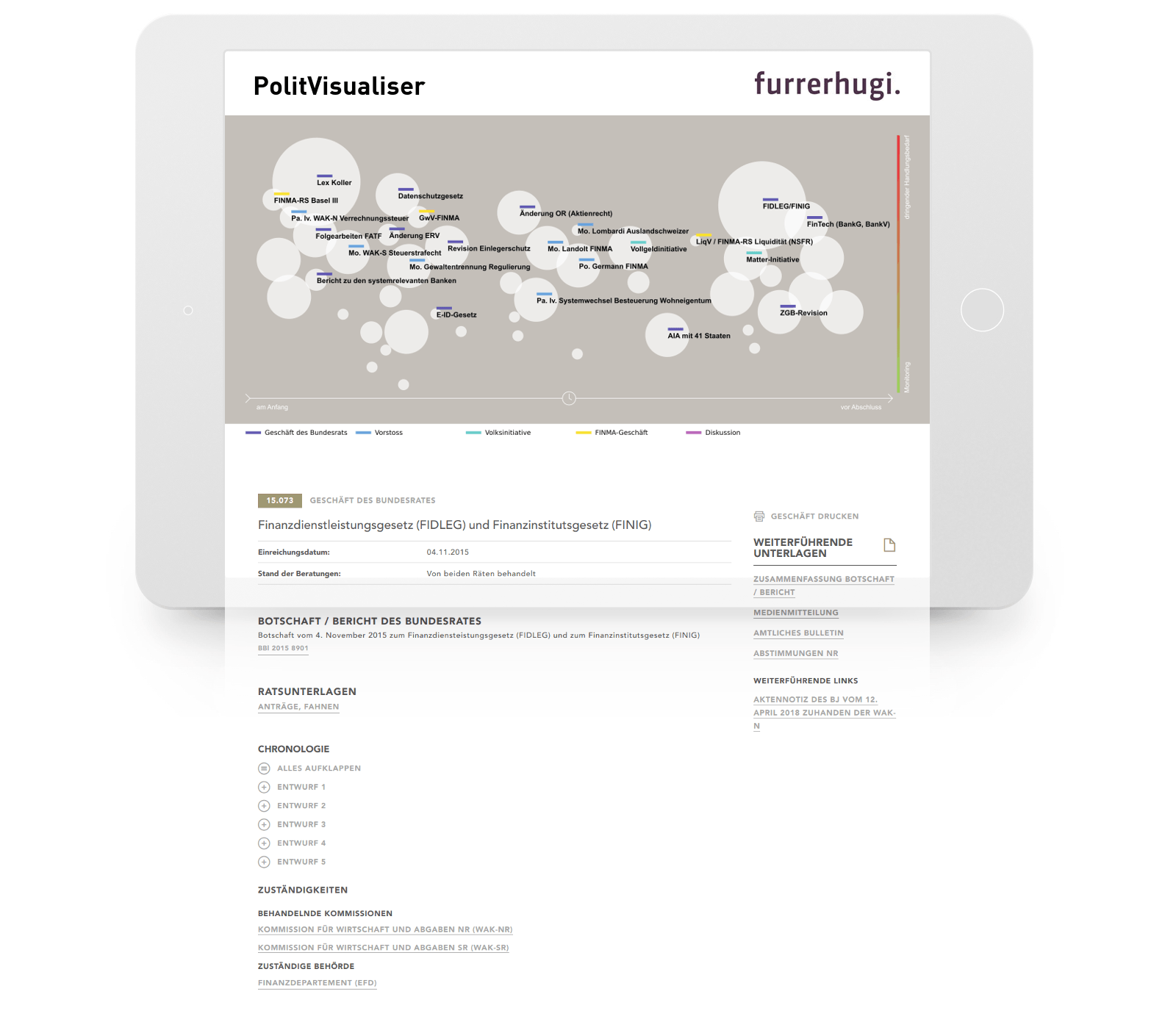
Datastats: interactive visualisation
Our team accompanies you along the entire journey, from the initial idea to the final interactive evaluation.
We support you in collecting data and/or extracting information from existing third-party applications via an interface, advise you on statistical issues and provide tips for optimal visualisation.
Thanks to our broad-based know-how in business intelligence, you can benefit from the experience we have gained from similar projects and analyses.
„Thanks to Datahouse’s agility, we were able to develop the PolitVisualiser in a very short time and thus turn traditional issue reports into a modern, interactive graphic. Datahouse has always found innovative solutions to our demands and developed the web application further step-by-step in line with the additional requirements that have arisen.“
Andreas Hugi, CEO furrerhugi. ag
Data collection
Wherever possible, data is collected in an automated manner. This ensures that freely available online data is obtained quickly and simply and can be updated at any time where necessary. The raw data from the various online sources, your own data and data from our datasets is stored in an appropriate database and prepared for further processing.
Preparation & visualisation
Before the collected data can be analysed, it must be prepared and cleansed. Duplicates are removed, while incomplete datasets are supplemented manually. This ensures that the data is plausible and representative and produces a cleansed dataset that can then be used for statistical analysis and visualisation. Where necessary, additional aids, such as map material from swisstopo, are used for the visualisation.
Interactive analysis
Content is viewed and represented thematically differently depending on your needs and requirements. As part of this, a range of visualisations and statistical models is employed to add context and make the data more expressive. Interactive analysis can be used for analysing markets, making predictions and determining trends and is an appropriate tool for representing a variety of scenarios clearly.
Key features
- Automated data collection in line with your needs
- Enrichment with additional data
- Data cleansing and preparation
- Interactive analysis
- Statistical analysis with a variety of models
- Analyses, predictions and scenarios
- Print-ready reports with modern graphics
- Exporting of filtered datasets
Functions
- The collection, preparation and enrichment of your data
- A concept for interactively evaluating various dimensions
- Versatile graphical types as desired and optimised for your specific application (histogram, scatter plot, box plot, line chart, geographic maps, etc.)
- Operation as an extranet solution
Options
- Export function for filtered datasets, choice of formats
- Automated statistical comparisons of filtered subgroups
- Connection to the third-party application via a defined interface
- Connection to other Datahouse products, for example to an interactive graphical analysis of your survey findings
- Conversion of evaluations into PDF format for integration into presentations
Proof of concept
Would you like to visualise data interactively, but are unsure whether our product meets your requirements? Then contact us for a non-binding discussion of your idea.